Rebranding Resistance Wine Company
The Company
Resistance Wine Company is a small family-owned wine brand. Kimberly and Kirk Drake, founded the brand based on Kimberly's passion and desire to create a natural wine without additives or other manipulations. Kirk is gregarious and hilarious (he does standup comedy as a hobby). Kimberly is reserved and traditional.
The Challenge
Their current marketing consists of Kirk offering tasting and sales as an add-on when he does speaking engagements around the country with his primary career in the credit union business.
The Assignment
The assignment was to rebrand the company and market it to a Millennial and Gen Z audience.
Project completed while employed at WineGlass Marketing.
Challenger Brand Positioning
The head of strategy positioned the brand as a Challenger Brand. I was charged with creating a new look and feel for Resistance to fit with the below persona:
• Informed
• Assumptive
• Bold
• Humorous
• Irreverent
• Outspoken
• Spirited
• A Pinch of Snarkyness
Existing Brand Assets
Creative Direction
How Challenger Brands Operate
Understand the rules. Then break them.
Make a stand. Be bold. Be confident. Be relevant.
Make people feel something. Show them how you’ve solved a problem for them.
Swim against the tide. Buck convention.
Make consumers love them. Real. Human. Don’t act or sound like the category.
Straightforward. Approachable. Nimble. Everywhere.
Three main aspects of the brand’s visual identity need to be addressed
New product photography
Color palette creation
Social media content direction
New Bottle Representation
Shifting from tradition
Resistance is not constrained by wine industry norms, and we demonstrated that by using non-traditional imagery.
Inspired by the hand-done style of the logo, I decided to use illustrations instead of traditional bottle shots. We integrated Resistance’s vector label art.
This non-traditional approach is unique in the wine industry. Most wine brands insist on showing bottles and labels in their marketing.
Inspiration
Inspiration and direction
For several reasons, I chose to steer away from the traditional bottle shot photography for Resistance:
A yearly shift in wine color due to no intervention in winemaking
Client non-budget for yearly photography to update said color
The bottle style is uninteresting
The labels are very similar
Content needed to be created quickly without input from the client as this is not their full-time career
This is the inspiration I gave the illustrator.
Color Palette
No existing color usage
No color guidelines existed. Primarily using black and white, and I wanted to give Kimberly a voice in the brand to balance the non-traditional bottle representation with a more traditional color palette.
First iteration
Inspired by wine colors and a warm color palette that would feel somewhat familiar to a wine customer, I also proposed that all white be changed to cream to create a softer feel. I designed the palette to the right, and the palette was approved by the client.
A turn
Kimberly contacted us a few days later and said, “If we are gonna go non-traditional let’s push it even further. We need it brighter!”
So I went back to the drawing board and created a brighter, cooler palette. I kept the cream because it balanced all the bright colors and brings in a surprising element when used with the vibrant color palette. The client was thrilled, and this is the palette we are now using.
Social Media
Humor and Education
Their previous organic Instagram presence was heavy on over-the-top sarcastic memes. We decided to take the posting to a more elevated presence but keep the humor. With a combination of custom illustrations and photography that poke fun at traditional wine culture. An illustration style that mirrored the bottle representation style is complemented by stick figure characters. We suggested non-traditional pairings, talk about why we don’t do buttery chardonnay, and represent the real life of our consumers.
Inspired by Sir Mix-a-Lot’s “Baby Got Back”, I directed details for our Big Reds Campaign to include knuckle rings, hats, and bottles to dancing on fruit in the background be integrated from the original inspiration.
We turned traditional wine photography styles on their head with these two pieces. We talked about why Resistance doesn’t do buttery chardonnay in this custom photo shoot, and why they don’t add extra sugars in this Photoshop creation.
When we use stock photography, we overlay text in the branded font to describe what we’re resisting to produce branded content in a budget-friendly way.
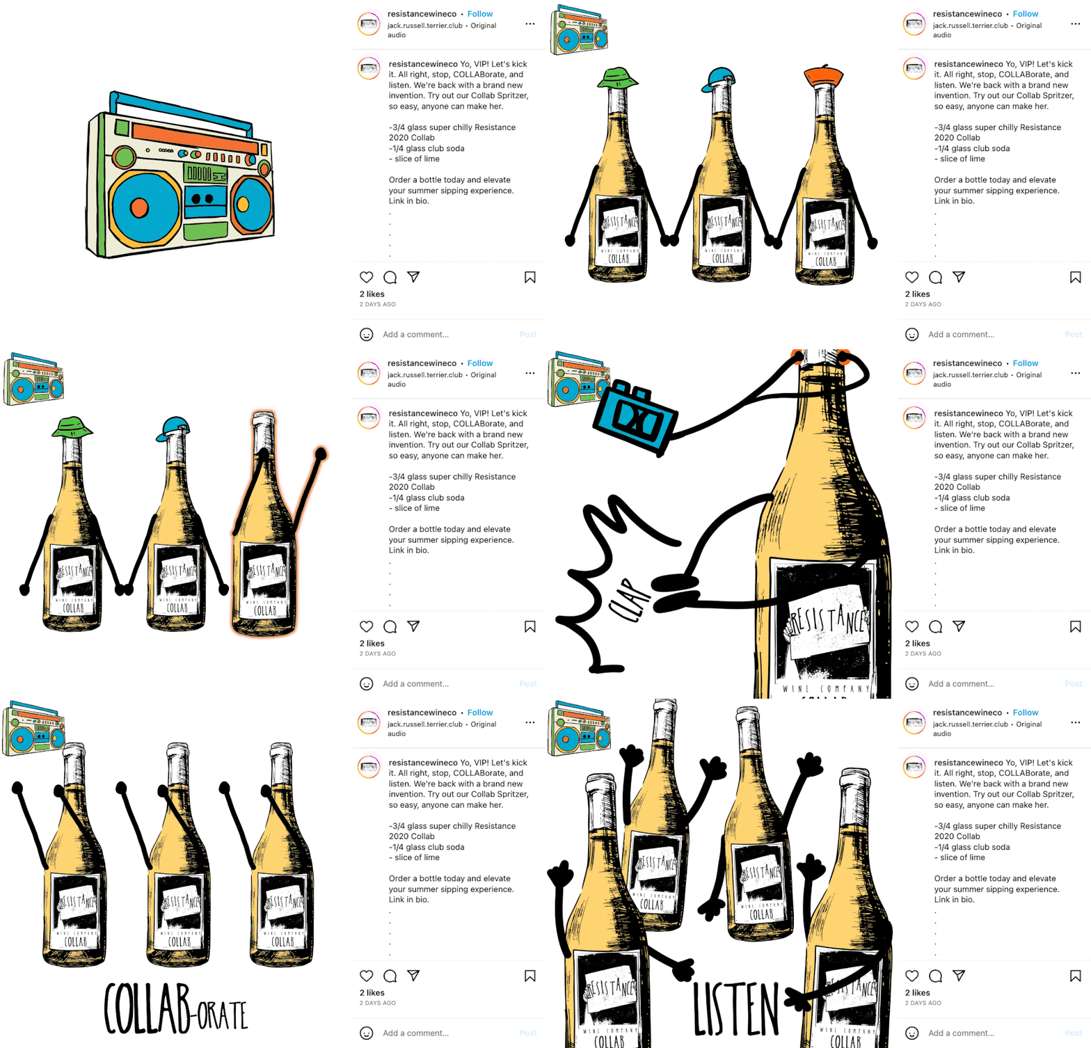
Inspired by the unique name of this wine, Collab, we choose to target millennials with a blast from the past inspired by Vanilla “Ice’s Ice Ice Baby”. Since the audio is available on Instagram we were able to use it royalty-free.
Email Design
Simple and focused
We keep the emails simple and focused with a single call to action.
The consumer recognizes the brand immediately because the illustration style, voice, and tone are kept constant over all marketing channels.
In this Mother’s Day campaign, we echoed the popular kid’s book series “Llama Llama” which will connect with the target audience.
LinkedIn Advertising
Holiday Gifting Campaign
Resistance already has a corporate audience because of Kirk's entrepreneurial ventures. We decided to go all in on the company's irreverent nature with this corporate gifting campaign that we targeted to administrative staff of companies that already have experience with the brand as well as a lookalike audience.
Website Refresh
A rebrand of the existing website was in order, so we implemented the new colors and illustration styles in a minimalist manner, focused on the wine, and what the Resistance resists.
Rebrand the Wine Club
From exclusive to convenience
The norm in the wine business is to offer regular shipments that are auto-charged on the member's card, and for signing up you get exclusive offerings and first dibs. This messaging does not appeal to the Resistance’s target younger audience. We rebranded the program as a subscription model. Instead of the producer telling you what you get, we gave the user control of the program.
This program was recently launched so I have no data on its success to date.
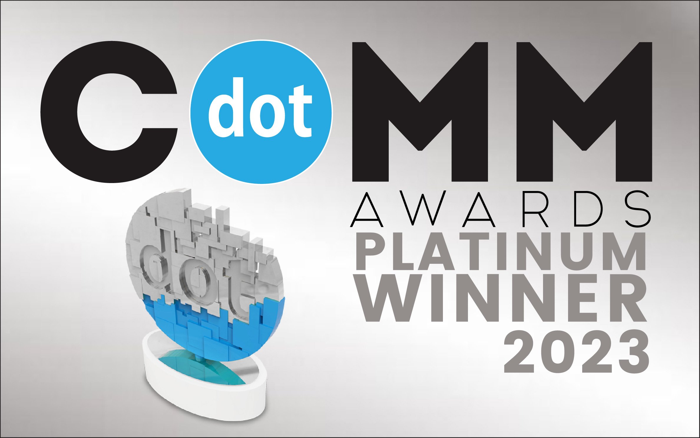
2023 dotComm Award Winner
This project won a Platinum Award from the dotComm Awards for Digital Marketing & Communications Campaign –Social Media Campaigns.


