Copalli Rum Website
The Company
Copalli Rum is a purpose-driven company. They produce organic rum on the coast of Belize. The company was established to help preserve the fragile ecosystem that was being adversely affected by the illegal logging in the region.
The Challenge
Design an e-commerce website to introduce Copalli Rum to the direct-to-consumer market in the United States. Through user research two target audiences were developed, the Conscience Consumer and the Flavor Explorer.
The Assignment
Design a user experience that served both the target consumers, giving them access to all the information they needed to trust and purchase from Copalli.
Project completed while employed at WineGlass Marketing.
User Personas
To better understand these users I researched potential users using in-person and online interviews. I created profiles of the two personas to present to the client.
Site Architecture
The site architecture design is key to making to content needed for individual users to find the areas they are interested in. The Conscience Consumer is more interested in confirming that the story Copalli is telling is true but for the Flavor Explorer finding information about the product and how to use it is key. We decided to give access to most of the content through the design of the home page and give each target 3 main navigation items that would relate to their desires. The Flavor Explorer was given Rums, Cocktails, and Crafting Process and the Conscience Consumer was given Ecosystem, Caoplli People, and Reviews. As the site was iterated this did change some but the basic idea was consistent.
Mood Boards
I created SEVEN different mood boards, below are a few of them. The Head of Strategy thought we needed to show more people and a sense of place and less rainforest so we iterated over and over until we had something that she felt gave the designer a clear picture of what the targets needed to see. Fortunately, the client had a library of assets so we were able to finally get to a mood that felt right. I wanted to make sure we integrated overlaying of leaf illustrations and bright colors that fit with the forest colors we knew had to be included.
Illustration
Inspiration and direction
We also needed to incorporate illustrations for pieces of the process that we had to show in a simplified form that photography could not capture. We wanted them to have a coordinate with the leaf sketches already in use and feel modern to connect with the audience. I gathered the inspiration to the right to give to the illustrator. I wanted a sketchy feel that would lay over clean color blocking to give the desired combination of hand-done and modern.
Final Illustrations
After a few iterations, we ended up with these amazing illustrations that fit right in with the existing branding.
Home Page Structure
2 Personas, 1 Design
The client had an amazing video that showed the Copalli culture better than any artwork we could create so we used it to immerse the user into the Copalli story at the top of the website. One thing we knew users might not like is an auto-playing video with sound so we gave them a very large audio off button in the bottom left of the video to make it easy to turn off. We thought the feeling of place that the video gave with the easy opt-out out- weighted the risk of turning off users with the auto-play video.
Buy Right Away
Knowing the entire point of the client getting a new website was to increase e-commerce so we included a BUY NOW prominently in the top right corner.
Read Reviews
It was very important to the client that reviews were easy to find as the company puts a lot of energy into submitting the rum for awards. We followed the video with a review and button to dig deeper accolades the product had received. We did not think this was high up on the consumers’ list of needed content but after several conversations with the client, they could not be convinced so we developed this compromise.
Dig Deep, If You Want
The Conscience Consumer and Flavor Explorer are given two sections of information that allow them to dig deeper into their desired topic. Our Mission and Our Rum give the users high-level information tailored to each persona. Each section is concluded with a Read More button that expands the page to give even more details. The user is never moved from the homepage, the section simply expands and a close section option appears. The background design is proposed shifted to a simpler design to allow for easy reading and focus the eye on the content.
Use the Products
We followed up the directed content with beautiful images of Copalli cocktails with buttons directly to the recipe page. This design decision was made to make the user feel confident that they could indeed use the product themselves and didn’t need to be a cocktail expert.
Sign Up
The home page design concluded with a CTA to sign up to learn more about Copalli.
Add To Cart
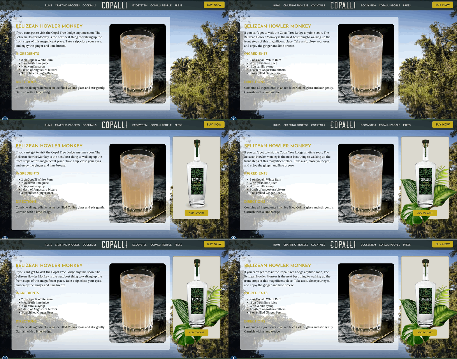
With the success of the website being measured by the amount of sales, we needed to add as many add-to-cart opportunities as possible. One place that made sense to make this action easy and appealing is when the user is viewing a recipe. While the user is making a plan to make a cocktail we wanted to make it as easy as possible to add that specific rum to their cart. I designed the animated concept of this add-to-card feature to give the user the extra push to purchase.
2023 W3 Award
This project won a Silver Award from W3 Awards in the General Websites-Food & Beverage category.


